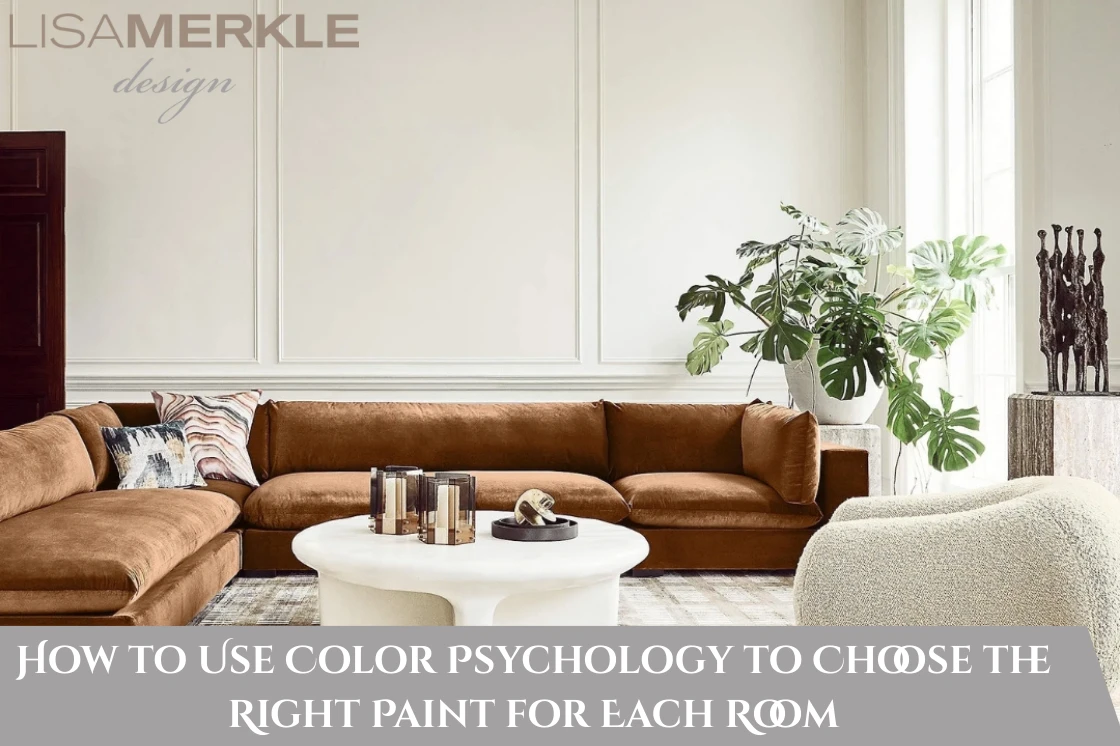
Walked into a room and suddenly felt happy or calm? Like, your mood just shifted. Not immediately, but maybe after some time. Or maybe you felt nervous and did not know why? Often, it’s the colors on the walls that make you feel that way.
There is color psychology in interior design at work here. Colors affect how we feel and how we think. They even change how we act. This guide will help you choose the best paint colors for each room. You’ll learn how colors can shape mood and feeling.
How Colors Can Affect Our Feelings
You see, Colors talk to our brains even when we don’t realize it. Blue can calm us, and red can make us feel excited. Green helps us feel balanced. These feelings come from years of experience. Nature plays a role, too.
A few years ago, my friend Amanda repainted her home office. She worked in finance and wanted more energy. She picked bright red paint. But soon, she felt more stressed. She couldn’t focus. Then, she learned about mood-based room colors. She switched to a soft green color. Right away, she felt calmer. She worked better.
By learning how each color affects feelings, you can make much better choices. Now, let’s look at some calming paint ideas. We’ll also explore some bold color palettes for each room along the way.
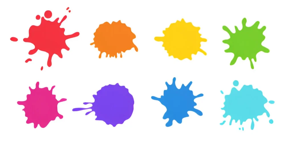
What Each Color Does
Blue: The Peaceful Choice
Blue makes us calm. It slows our heart rate. It helps us relax. It’s great for bedrooms and meditation rooms. Bathrooms also benefit. Light blue can make small rooms feel larger.
Michael and Sarah had a baby born early. They painted the nursery light blue and added gray trim. Their baby slept better because the whole room felt much more peaceful.
Red: Full of Energy
Red gets attention. It makes people talk more. It makes them feel hungry. This works well for dining rooms. But too much red can make you feel restless.
My cousin Jenna once painted her dining room deep red. Family dinners were fun and lively. But people didn’t stay long after eating. The red may have made them feel ready to leave.
Yellow: Bright and Cheerful
Yellow brings happiness. It gives energy. It’s perfect for kitchens and breakfast rooms. Very bright yellow can feel overwhelming.
Susan was a teacher who painted her kitchen a soft yellow. The color was creamy and warm. She started every day with a smile and felt cheerful in the mornings.
Green: Balanced and Calm
Green mixes the calm of blue with the cheer of yellow. It helps you feel balanced. It’s good for living rooms. Home offices and libraries also benefit.
Jake, a writer, painted his study moss green. The color reminded him of nature. It helped him clear his mind. He could focus better on writing after that.
Purple: Fancy and Creative
Purple feels fancy. Light purple calms you. On the other hand, dark purple adds drama and works well in bedrooms. Reading corners and accent walls also shine with purple.
My neighbor Linda painted her craft room a soft lilac. She said it made her feel creative. Her kids also spent more time crafting there.
Orange: Fun and Welcoming
Orange gives energy but doesn’t overwhelm it. It works well in exercise rooms. Casual hangout spots feel lively with orange. Light peach shades make entryways feel welcoming.
Emma painted her home gym coral orange. She found herself exercising longer. She felt more motivated every day.
Neutral Colors: Simple and Timeless
White, gray, and beige walls give a clean base. They help your furniture and art stand out. Decor pops more, too. Add texture and color to keep the room lively.
Ben painted his apartment light gray. His colorful art popped. The green plants added life, and his home felt cozy and modern.
Picking Colors for Each Room
Paint color selection depends on how you feel or want to feel in each space.
Bedroom: Calm and Restful
Use calming paint ideas like pale blue and soft green. Light purple also works well. These colors help you relax and sleep better.
Living Room: Warm and Friendly
Pick warm neutrals. Soft greens and gentle yellows help people feel comfortable. They encourage more talking.
Kitchen: Bright and Energizing
Use warm yellows. Light oranges and soft greens work, too. These colors make you feel happy. They also make you hungry. They look nice with wood cabinets. White cabinets match well, too.
Home Office: Focused and Calm
Avoid bright, bold colors. Cool blues work best. Greens and warm grays help you concentrate. They don’t make you feel tired.
Bathroom: Fresh and Relaxing
Light blues feel clean. Pale greens bring a calm vibe. Crisp whites make bathrooms feel like a spa.
Dining Room: Inviting and Fun
Deep reds feel cozy. Warm oranges invite conversation. Bold navy blues make dining rooms feel special.
Staying Up to Date with Paint Trends
Every year, new paint trends become popular. Recently, earthy tones gained attention. Rich greens feel trendy. Warm terracottas add charm. But trends should not be your only guide.
For example, deep forest green was popular in 2024. It feels trendy and calm. It works well in home offices. The living rooms look great, too. Muted clay tones feel modern. They offer a grounding warmth.
Don’t follow trends just because they are new. A trend is like a guest. It will stay only for a few days. Choose colors that fit how your heart wants to feel. Your home should help you relax. It should not just look good in photos.
Easy Steps to Pick the Right Color
1. Know What Each Room Is For
Think about what you do in the room. Do you want to relax or focus? Maybe you want more energy. Your answer helps you pick the right color.
2. Look at the Natural Light
Bright rooms can handle dark colors. Dark rooms feel better with light colors.
3. Test the Color First
Paint a small area on the wall. Look at it during different times of the day. Light changes how colors look.
4. Mix Bold Colors with Neutrals
If you enjoy bold colors, be sure to balance them with neutral tones. A bright teal wall works well with gray furniture. This keeps the look bold but not too much.
5. Trust Your Feelings
Your reaction matters. If a color makes you smile, it’s the right one. Go with your gut feeling.
My Own Color Story
When I bought my first home, I made mistakes. I picked colors straight from the store. My living room ended up bright yellow. The bedroom was a harsh blue. Guests tried to be nice. Still, the colors felt wrong. Painfully, I could tell myself.
After reading about color psychology, I repainted everything. The living room became beige. I added soft green accents. The bedroom turned pale blue. Finally, my home felt calm. It was now feeling like a home I could call sweet.
Why Color Psychology Is So Important Today
Today, we deal with noise and screens all the time. We face stress every day. Our homes should help us relax. Color psychology helps create peaceful spaces.
Think about your favorite coffee shop. Or a nice hotel. Their color choices make you feel calm or fancy. They plan those colors on purpose. You can do the same at home.
Get Help For The Right Shade
As expert interior designers, we help you create calm and beautiful spaces that show your style and energy. Book a free consultation today. Your vision will come to life.
Final Thoughts
Color psychology in interior design works a great deal. You don’t need to be an expert. Still, you can choose the right paint colors. Pay attention to how colors make you feel. Combine your feelings with what you have learned here.
The result will be a home that makes you happy every day.
In the end, your home won’t just have nice walls. It will give you comfort. You’ll feel joy and peace every time you walk through the door.